Neoke | Digital Identity, information management & AR
Summary
The purpose of this project is to reinforce the USPs of the Neoke App, creating value that will attract new users and, with a big enough user base, also more service providers. The core of our task was to explore the possibilities of the Neoke Wallet when outside of the ecosystem, especially when navigating forms and check in cards in paper form.
The client
Neoke is an Amsterdam based start-up reimagining travel with a suite of digital identity solutions empowering their users with the control and ownership of their data. Their platform offers a streamlined process of booking, check-in, data sharing and of course: identity verification. NeoKe has secured funding of €1.3 million from Dreamcraft Ventures, ff Venture Capital, GHARAGE: Vision Hub of Gebr. Heinemann and Plug & Play.
Neoke presented us with the goal of designing and integrating anautofill feature for paper forms, that would allow their users to navigate check-in processes also outside of the platform ecosystem. The main purpose is streamlining the process for Neoke users, but it is also a good way of incrementing the USP for the App and its appeal for a broader audience.
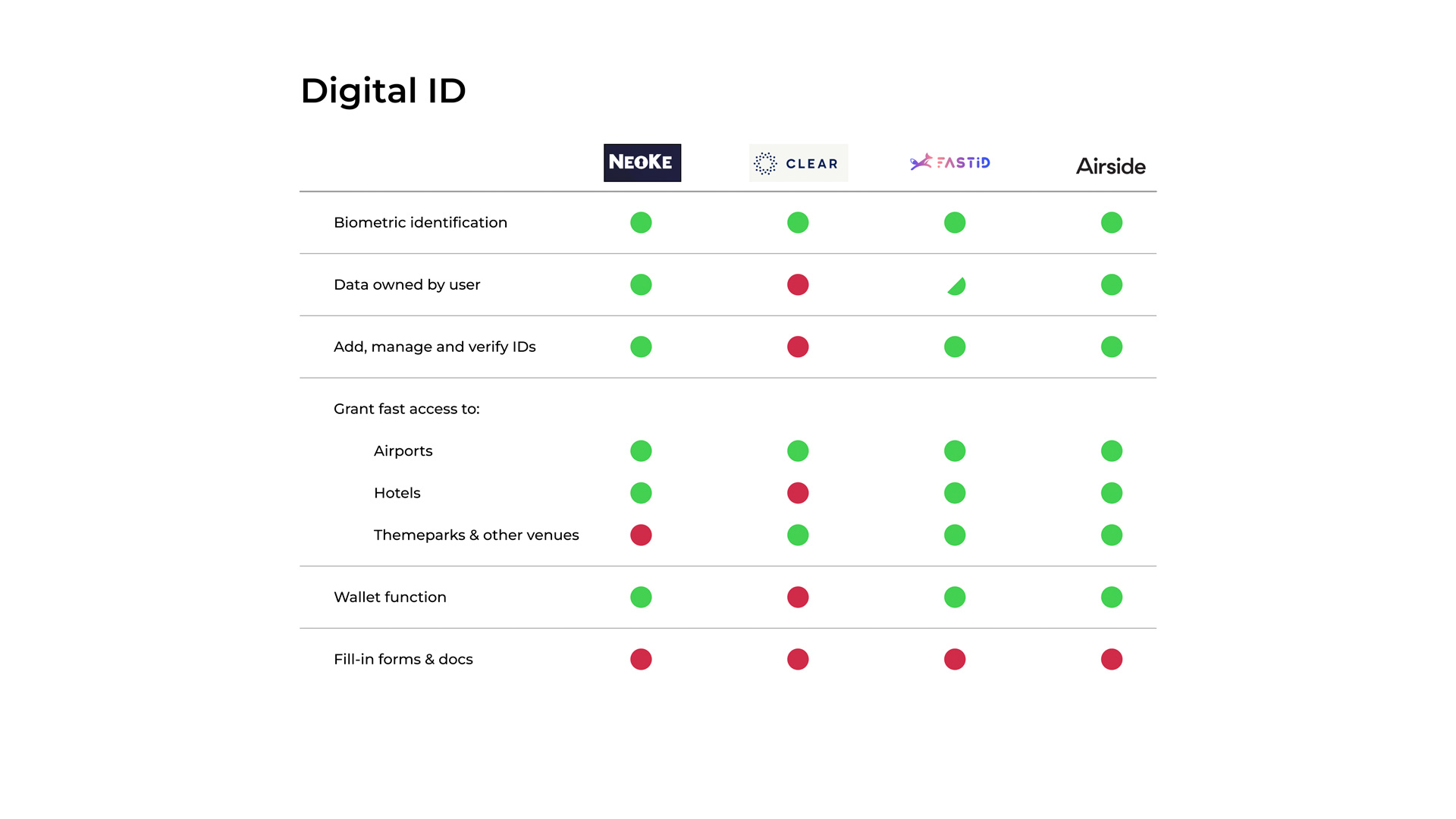
The initial steps began with market research, including trend identification and analysis of existing solutions. Although there is presence of competitors in the Digital ID and gating fields, direct benchmarking was limited due to differing profiles and features.
Our research strategy involved analysing three main groups: Digital ID, translation apps with augmented reality (AR), and document and form managers (scan, fill and sign apps). Desk research provided valuable insights that informed the first stakeholder interview. During this interview, discussions centred on the stakeholder’s product, their current user base, and future plans. Additionally, a series of activities were organised to uncover assumptions about how users interacted with paper forms.
User research: survey & interviews
Survey
We pursued quantitative data by creating a survey to understand user preferences and behaviors related to travel. The survey covered demographics, travel planning, frequency and purpose, accommodation choices, identity and data sharing, as well as friction points in the journey.
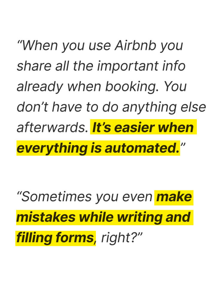
Surprisingly, the survey results contradicted stakeholder assumptions. The check-in process and form filling were not identified as pain points, whereas booking flights and hotels emerged as the primary areas of concern.
Travels 3+ per year
+0%
Stays in Hotels
+0%
Books Online
+0%
Finds check-ins challenging
0%
Some of our key survey results
So, are we addressing a real problem?
We decided to deep dive into ourtravellers journey through interviewing them. We broadened the focus and settled on the points to touch down during the interviews: habits, check-in processes, filling forms and sharing data. The profiles of our interviewees were quite ample: expats travelling to visit family, people travelling with children, professionals and work, we even managed to talk with an ex hotel manager and a retired airline pilot.
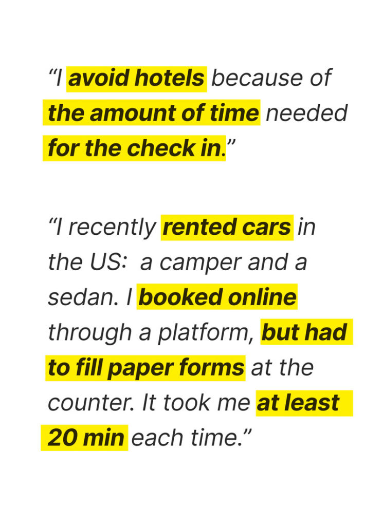
We also took the opportunity to ask them about their use of navigation apps (i.e. Google Maps), AR translators, especially about the circumstances they use them. Data was then extracted, analysed and sorted it in an Affinity diagram. It was then clear that there was indeed friction in the check-in processes.
Users perceive many of the standard form filling and paperwork as a waste of time. They believe that usual personal information and details could be shared in a more convenient way.
User Persona
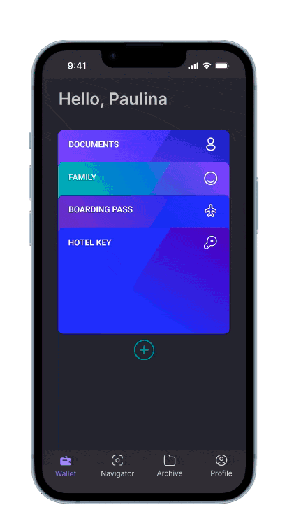
Meet Paulina, a business owner and mother of three from Norway travelling to Barcelona for holidays. She plans family trips, books online travel services, and always aims for a seamless holiday experience, including managing her children’s IDs. She represents our users, crystallises their needs and goals, and will define the problem to solve.
Her Journey
Paulina’s holiday planning led to digital booking confirmations for her flights, hotel, and car rental stored on her phone well in advance of her departure from OSL airport. However, after her flight, waiting at the baggage claim and the train journey to her hotel, she encountered redundant forms requesting the same information she had provided months ago during booking.
Problem Statement
With the identification of friction points in different phases of travelling, and the insights about our interviewees habits regarding automation, navigation and AR, we defined our problem statement.
Which we broke down into the 3 following HMW questions:
How might we aid users navigate forms & docs outside of the Neoke Ecosystem?
How might we streamline Check-ins requiring paper forms?
How might we navigate travellers through texts and forms in languages they don't understand?
Minimum Viable Product
Performing a MoSCoW analysis, we decided that to focus on ID management, Wallet functionality, AR navigation, Aufofill and sharing files. We also agreed to shift the scope of our product from the check-in situation to a broader, more general purpose solution. Through the interviews we noticed that the “navigator” could potentially aid in other situations.
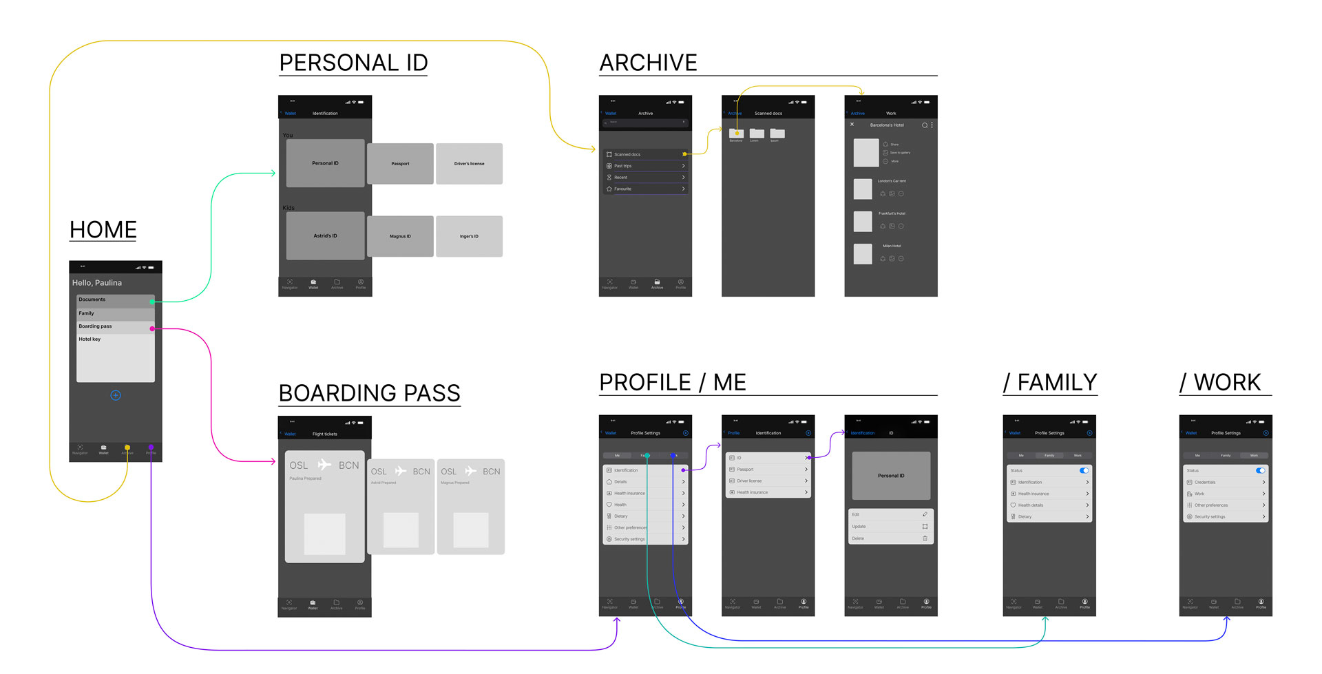
Site Map
During the brainstorming process, we came out with some ideas on how to structure and present information. Even if it was out of scope of our main task, we stepped into the structure, screens and user flow for the whole app. We structured everything into 4 main sections:
Wallet, (home) providing easy access to ID’s, Travelling and gating docs (boarding passes, Tickets, etc)
Navigator, (our core task) an augmented reality tool to navigate, fill and scan documents in paper format
Archive, a section to manage, store and manage files
Profile, to manage digital IDs, personal information and preferences
User Flow
This flow concentrates on the Navigator feature and two main tasks: the filling of forms, and AR live navigation. It’s an overview of the tasks that users can accomplish with the feature.
Form filling: input from an existing file or through camera. As autofill is enabled, noteworthy information is presented to the user to decide procedure. Output format either digital, by sharing a link, or paper, following the screen as a template to physically fill the forms.
AR live Navigation: the feature as an augmented reality to navigate menus, texts, forms by translating, overlaying information stored in the user profile.
We then created the first rough approach to the UI by hand sketching the different screens. The home screen shows a stack of cards in what’s become an industry convention (google wallet, Apple Pay, etc.), and aligns with Nielsen Norman Group‘s 2nd Usability Heuristics for UI Design (match system and real world).
A first conceptual prototype was created to test and iterate the structure, the flow and some of the key screens. We also analysed the apps we had previously benchmarked to identify any usability conventions applicable to our project. This initial prototype was internally tested, refined and translated to a Mid fidelity Prototype.
Mid Fidelity Testing
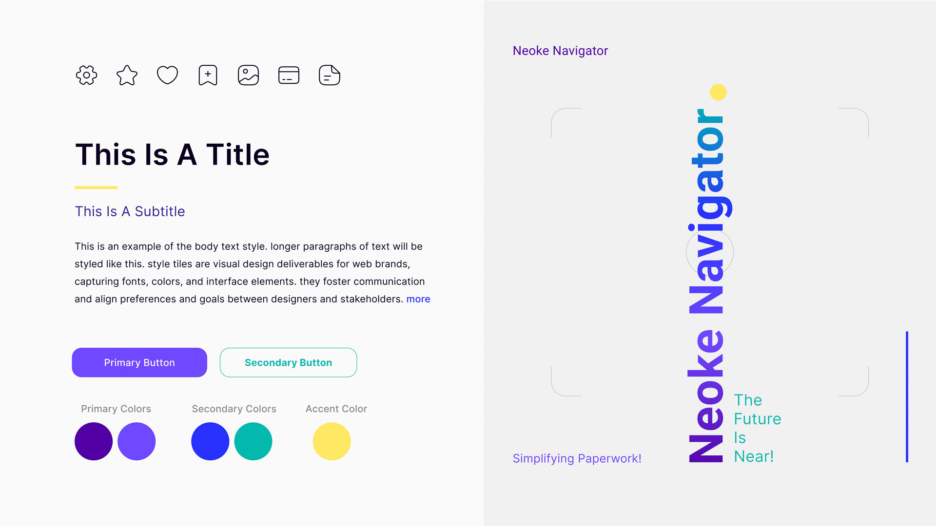
Following the IOS Design guidelines, we created basic components and their variants in Figma to compose the UI, prioritising the elements to be extensively used, like the navigation bar and some icons. This allowed us to quickly react to userfeedback and iterate our solution.
We categorised user feedback in two main groups:
ID & doc Management, related to general app, where we our testers reportedminor issues regarding to naming conventions, and lack of status confirmation during some steps.
Neoke Navigation, for anything related to the feature we developed for this project. The biggest challenges in this category were related to onboarding during the different navigation processes.
While analysing Neoke’s Branding and Style, we realised that the overall look and feel was undoubtedly leaning towards a professional / luxury concept. Their website imagery associates exclusively to what could be described as executives travelling for work.
As defined by our research and user interviews and our intention of appealing to a wider audience, we decided to work on the Branding, keeping the minimalistic approach but taking off the edge. Aligning to this objective, although not implemented in the prototype, we developed a “Light mode” Style tile.
Our solution was prototyped in Figma, combining the insights coming from the mid-fidelity testing and the Style tile guidelines. Although the task of our “happy path” was digitising, auto filling and sharing a check-in paper form at a Hotel desk, our prototype explores other core aspects of the App: Wallet, Profile and the live Navigation.
Wallet / Docs
Profile / Edit Details
Wallet: shows how user access and navigate the ID and travel Documents: Personal ID’s, Family, Boarding passes and digital Hotel keys. Users can also create and manage custom cards.
Profile: how users can manage different profiles, and edit their details. This includes identity, Health and personal preferences among others.
Navigator / Check-in Process
Navigator / AR Live Overlay
Check-in Process: our happy path, showing the digitising, filling and sharing of digitised paper forms with service providers outside of the ecosystem.
AR Live Navigation: offering more than just translation. The app overlays useful notes by crossing the information stored in the user profile, aiding in the navigation of documents. In this case, a restaurant menu.
Take aways and Next steps
Not only for travel:we approached this project, as per briefing, focusing on check-ins and the travelling context, but a tool such as Neoke, combining information sharing, security and auto-filling has a lot of potential: many day to day activities such as visiting the doctor and government paperwork could benefit from this automation solution.
A/B testing and iteration: although the current flow accomplishes the task, the process of digitising and filling could be streamlined further by refining the process and polishing the onboarding. This could also be a good opportunity to study other use cases.
Collaboration with the implementation team: this is the right timing for getting the developer team onboard: we have enough material to start discussing about implementation and trade-offs. Initiating collaboration soon would aid calibrating the required effort in terms of design and development to successfully implement our solution.