Santa Rosa Bio | Storytelling and E-commerce
Summary
A client with a wonderful product in a steadily growing market, with an e-commerce site lacking punch: how to improve internet presence and create an appealing brand image to reach potential clients? Our strategy: content, storytelling, and a user friendly e-shop.
The client
Santa Rosa is a family run business dedicated to olive oil production with biological certificates located in Calabria, Italy. They have been producing oil since 1840 and, unlike many other producers, they have their own mill facilities to extract the oil from the olives, allowing them to control the complete process, from harvesting to bottling.
Although their core business is B2B, in the last few years they have been trying to get into the B2C market without success. They currently have a website but in the years it has been online, no purchase through that channel was made.
Process Overview
Click on title to jump to section
- Desk research / Competitive analysis / Trend spotting
- Kick-off meeting with Neoke Stakeholders
- User Research: quantitative & qualitative
- Affinity Diagram / Empathy Map / User Persona / Journey Map
- Problem Statement / HMW / MOSCOW & MVP
- Ideation / Architecture / User flow
- Lo fidelity / Mid Fidelity / Testing
- UI design / Moodboard / Style Tile
- Hi Fidelity Prototype / Testing
- Desirability testing: Microsoft Reaction Card Method
- Handover to Santa Rosa Bio
The Team
- Laura Canal
- Martina Codato
- Martin Caneda
- Pierre Farfán
The Task
Redesign our clients e-commerce website and create an appealing Branding that communicates the companies roots, tradition and love for the products they propose. Develop Storytelling that shows who stands behind the product and their values. Design a a smooth and seamless purchase experience that puts quality Extra virgin olive oil close at hand of the consumers.
Market trends & innovation opportunities
The European market for olive oil was valued at ≈ 7.5 billion Euros for 2020, with a consumption of 1.46 million tonnes in 2021, which equals to about half of the world consumption. Consumption of olive oil in EU countries (excluding Spain, Italy, Portugal and Greece, the main producers) is expected to rise about 4% annually. There is a growing trend for the niche of premium and quality products.
Meet our stakeholder
During our pleasant chat with Nicola Tocci, we got to understand the production process, the products they have in catalog and also the pain points keeping Santa Rosa away from selling directly to the public. From the B2C point of view, they have 2 main blockers: logistics and their E-commerce platform itself. The logistics required for successfully shipping a product to the end consumer after a successful web purchase , falls outside the scope of this project. Their website, on the other hand, will be at the focus of all our attention.
The "as is" situation
Besides looking a bit dated, and being completely user unfriendly, it has fundamental problem: it looks, feels and has the intention of being an e-commerce website but doesn’t provide closure to the process: it is impossible to buy a product. The same happens if you try registering and opening a profile.
Another relevant point raised by our stakeholder was that despite being a family company with a story as rich as it can get, they lack the storytelling. They aren’t able to transmit their brand and its values to the general consumer. Their site, wasn’t helping either.
Current B2C Clients
Their current customer is regional, and knows the company from since forever. Their non regional customers are originally from the region, living in northern Italy, and more often than not, are relatives of the regional customers.
So, how to reach new customers? Nicola knows that there are more potential clients both in other Italian regions and in the UE, but they are not able to connect with them. Although they do have some social media exposure, the profiles are not linked to their site.
Meet our competitors: competitive analysis
Nicola gave us some company names that although not being oil producers per se, were marketing regional products in a successful way. All of them had online presence, fully functional e-commerce sites.
The methodology we used to study our competitors was SWOT (Strengths, Weaknesses, Opportunities and Threats) analysis for both the brands and their features. They all propose quality Italian products to an audience composed mainly of foodies and Italian cuisine lovers.
In terms of features, all of them except for one had websites with versions in at least english language, the possibility of creating a profile and different kinds of cross-selling. Other important features included different payment methods, blogs, reviews and of course, a way to actually purchase the products.


Meet our target audience: qualitative data
We conducted interviews to gather valuable information about users habits and insights regarding olive oil, its use, its purchase and also the channels they are getting their supply from. All of them perceive olive oil as an important ingredient of a healthy diet and use it, in more or less quantity, daily.
In general, they purchase it in supermarkets, but some would be interested in buying directly from the producers if that meant better quality/price ratio or simply getting to know first hand the origin of the product they consume.
And what about pain points? they struggle to access products with a good quality/price balance, because price is an important decision driver for them. The channels they usually use, don’t stock small batch producers like Santa Rosa, which, on the other hand, can offer a better quality at the price point they are after.
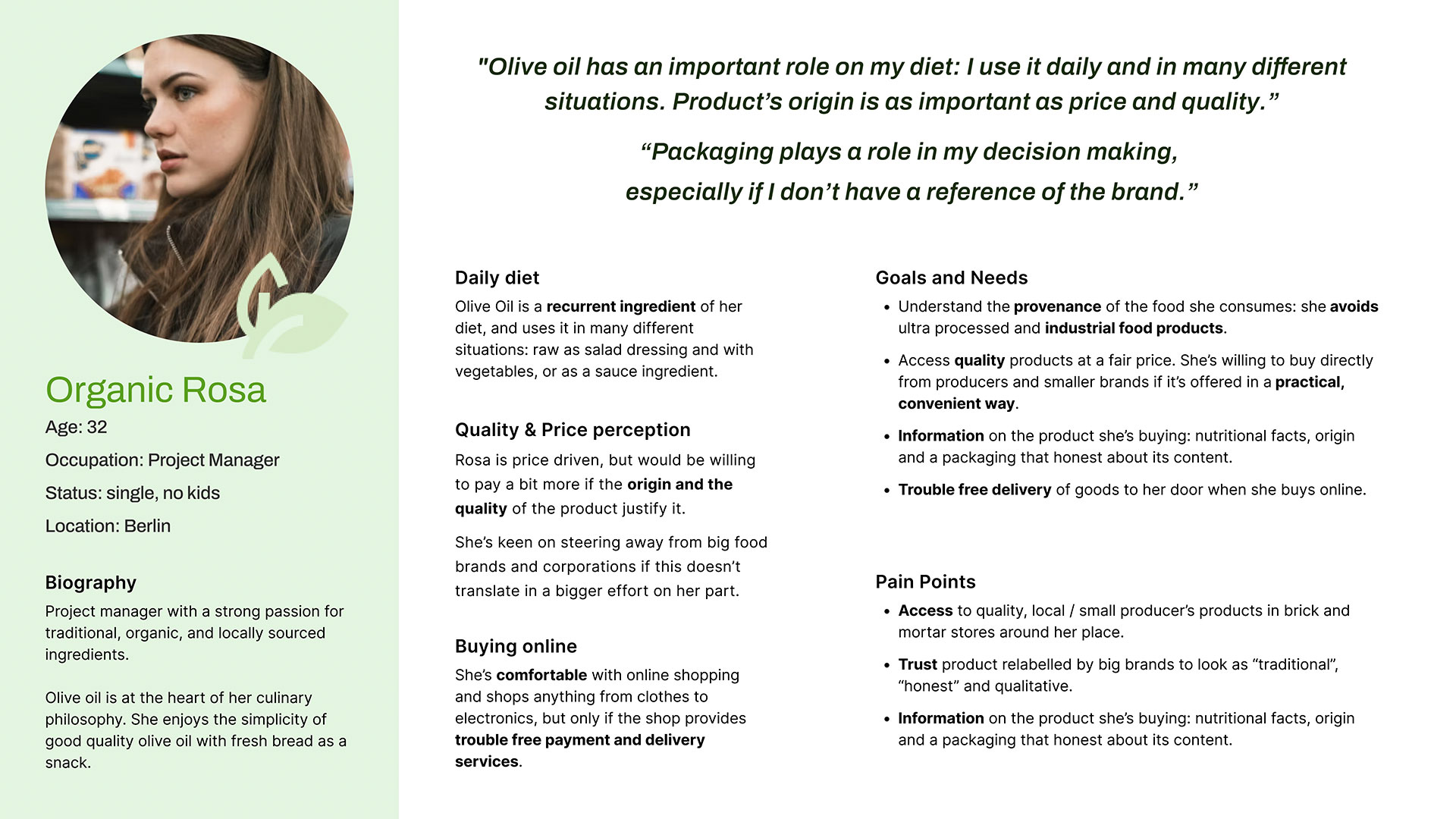
User persona
Our target audience ambassador is Organic Rosa, a Berlin based product manager with interest in healthy food, that usually to opt for mid range olive oils. She uses social media, buys online, and food and cooking content are appealing to her. She struggles to access to qualitative olive oil at an affordable price, products with a known origin and producer. The kind of products that the supermarkets where she visits for grocery shopping are not offering.
Her Journey: discovering Santarosabio.it
Rosa’s journey with Santa Rosa’s olive oil starts by chance: she sees a post in instagram showcasing one of its products. Unfortunately, the profile bio is not linked to the website. Luckily she’s proficient with internet search engines and after dropping “Santa Rosa olive oil” in the search field, she finds its website.
Proceeds to navigate the product catalog and, avoiding impulse buying, she settles for a monocultivar 0,5 liter bottle. Unfortunately it is impossible to purchase it because the website is not working. Closes the browser, and decides to buy oil as usual, in the supermarket.

Problem statement
With the insights gathered from our interviews and Organic Rosa’s journey, we defined the following problem statement:
Which we broke down into the 3 following HMW questions:
- How might we display quality through an online channel?
- How might we design a system that promotes costumer engagement and repeats purchase?
- How might we create a more user-friendly online shop able to guide the consumer to the purchase of the product?
MVP statement
We used the Moscow methodology to understand what are the compulsory features needed to design a basic but functional solution to start interacting with the audience.
This statement helped us focusing in delivering a spartan but yet fully functional design to get our solution for Santa Rosa and its target audience going. Concentrating the efforts allows us to test earlier and correct accordingly, iterate and secure that when it finally hits the web, it will be the best it can be. It won’t be final (nothing ever is), but it will allow it to grow over time, adapting and refining as it goes.
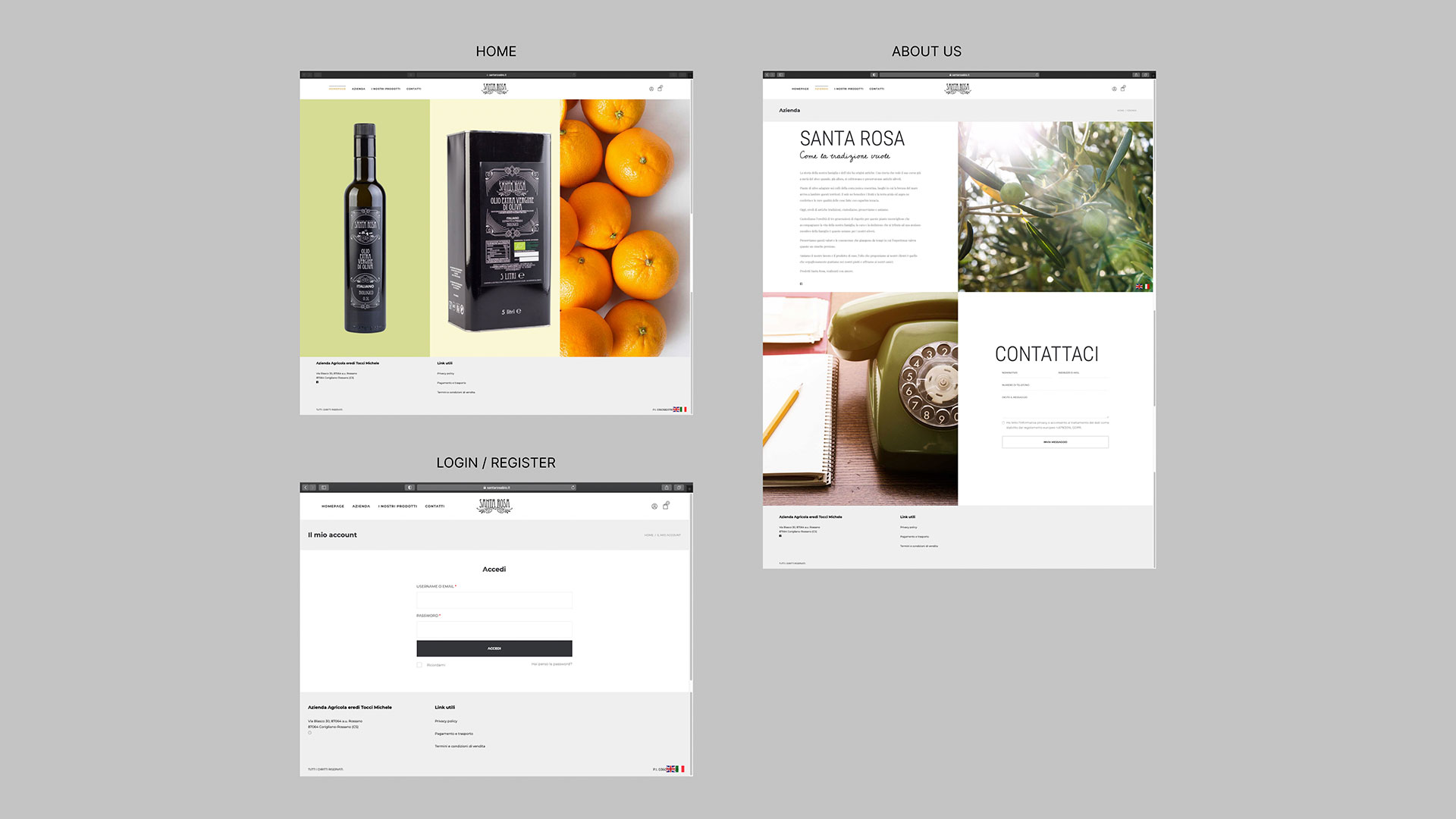
Site Map
How does the MVP translates to the the new website design?
- About us: the story telling, the face of the company behind the Olive Oil.
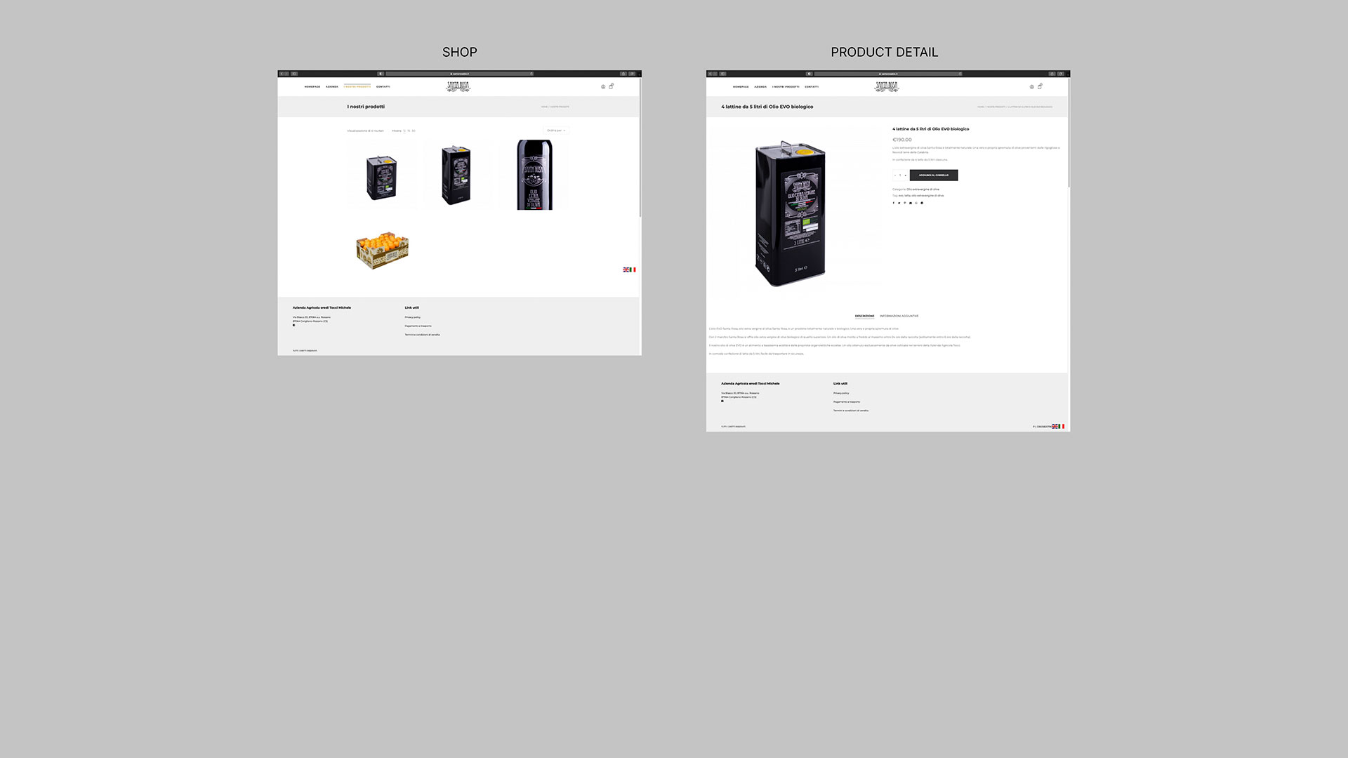
- Shop: the display for people to see the complete product catalog, choose and ad to the cart.
- Cart: order management, payment channel and delivery info.
- Account: either registered users or guests, will need to input their data.
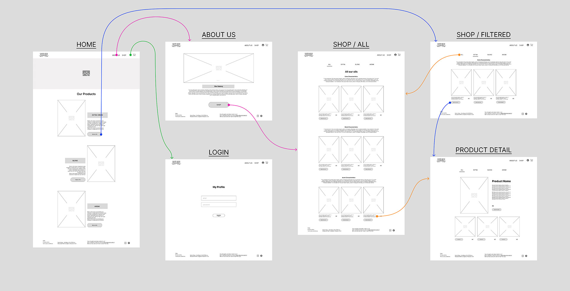
User Flow
Visualizing what the users will need to do in order to helped us streamlining the process and providing the necessary elements for them to navigate Santa Rosa’s site in a seamless and pain free way. Our happy path involves successfully buying one of the products. Once sorted we started with the refining from the first low fidelity sketching.


Low Fidelity
The initial approach involved creating low-fidelity hand sketches, which served as a practical tool for rapidly brainstorming ideas within our team. Considering the limited product catalog we were working with, we reached the consensus that crafting compelling content and storytelling for the different product ranges and their unique attributes would be crucial.
The homepage provides a glimpse into our three product categories: Monocultivar, Blend, and Aromi. Each category is accompanied by a clear call-to-action (CTA) that guides users to explore the products within that specific category.


Mid Fidelity Testing
The final iteration of the Low Fidelity prototype was subsequently transformed into a Mid Fidelity version using Figma. This transition allowed us to initiate testing of the navigation system and task flow. Overall, the web navigation, particularly within the Shop section, proved to be remarkably trouble-free, largely owing to its adherence to a shop structure convention, characterised by clarity and consistency.
The filter bar also garnered positive feedback as it seamlessly facilitated both navigation through the product catalog and provided users with valuable information about their current location within the platform.
Despite the constant presence of the Navigation bar across all screens, a Call to Action (CTA) efficiently guides users from the “About Us” page directly to the unfiltered shop screen.

Brand attributes: what our proposition to the target audience?
History and tradition are important for Santa Rosa: their long history and experience in the production of olive oil is an opportunity to stand above their competitors. So the branding has to reflect this somehow.
But we also want the target to perceive the brand as a brand that is up to date, that understands their needs, expectations and that is up to date with the digital commerce channels and services. To put it short, a heritage brand that’s also fresh. Our brand attributes: Familiar, Tradition, Elegance, Contemporary and Quality.
Style tile: color, typography and components
Serif can transmit 3 of the attributes we settled for: tradition, elegance and contemporary. We settle with Cormorant Garamond because of the different weight availability , allowing us to use it extensively. Photographs in the “About” section are displayed in B/W as they reinforce the tradition and contemporary look.
In terms of color, and seeing that “air” and black and white were to play such an important role, we decided that the accent color had to be a saturated green to bring up the contemporary edge. This color was used especificly for CTAs.

Hi Fidelity Protoype
Using our style tile as a reference point, we embarked on the development of the components by following the principles of the atomic design methodology. Even though the current phase of the project didn’t necessitate an extensive array of elements, establishing a system that can easily scale and adapt is always a wise investment. Such an approach not only saves time but also fosters consistency for future endeavors.
While we continued to employ Nicola’s product images for the shop section, we relied on Chat GPT and Adobe Firefly Beta to generate all the content for storytelling and photography. This enabled us to establish a strong foundation in terms of tone and the overall look and feel, providing a solid starting point for the copywriter and photographer to further refine the content.
The happy path
Our Happy Path can be broken down into two primary tasks: the initial phase involves browsing the product catalog to locate two specific items and adding them to the cart using two distinct methods – either from the product detail screen or directly from the shop. The product screen offers details regarding the product, including its attributes, flavor, and potential applications. The primary objective of this screen is to furnish users with crucial information to help them make informed purchase decisions.
The option of adding to cart directly from the shop, aims to speed up the process for returning buyers that know the products, or users that have an understanding of the product characteristics. Hints on the flavour are provided in the product description such as “Frutity flavoured” or “Delicate & sweet”.
The second part of the Happy Path, covers the check-out and required data input to proceed with the purchase. The screens guide the users through the different steps: Contact details & delivery / billing address(es), payment details and order check & confirmation before proceeding to payment. During the whole process, the user is presented with options to change and correct the information. Last screen is the confirmation of a successfully concluded process.


Hi Fidelity Testing
We conducted testing on our Hi-Fi prototype to validate the insights derived from the Mid-Fidelity stage, aiming to identify any potential issues along our ideal user journey. Additionally, our objective was to ensure that the visual elements assessed during the Branding and UI phase were effectively implemented in our solution, aligning with our objectives and resonating with our target audience.
Regarding functionality, certain testers encountered difficulties when navigating the product catalog. They expressed a sense of confusion while scrolling through the products, although this was perceived as more of a feeling than an actual problem. We engaged with them to identify the root of issue, which ultimately traced back to the utilisation of the same product images across all product lines.
With the final artwork in hand, along with distinct labels & packaging for each product to serve as a visual differentiator, we are confident that the previously identified friction points will be resolved.
Desirability testing: Microsoft Reaction Card Method
In order to assess the visual outcome of our Hi-Fidelity prototype, we compiled a list of 30 words in accordance with the Nielsen Norman Group’s guidelines, incorporating our brand attributes into the list.
We presented our testers with screens from our solution and requested them to choose 5 words that best represented their perception of the overall aesthetic. The term “Contemporary” emerged as the most frequently chosen word, achieving an 82% preference rate. When asked about the line of thought behind it, they linked it to factors such as the layout, serif typography, and the clean appearance.
The second most prevalent concept was “Traditional”, primarily because the testers associated the presentation of our products with what they typically encounter in the wine industry. One of the testers even described it as “boring” in a positive sense. The terms “old” and “History” were also employed to elaborate on their thought process in selecting this concept.
Conversely, the term “Familiar” did not receive any selections. Upon analyzing the results, we deduced that in this context, “Familiar” closely resembled “Traditional”, with the latter being a more accurate reflection of the final result.


Next steps
Branding: Although the rebranding fits quite well with the current packaging and labelling, the new design should be reflected also on it, reinforcing the brand identity and presenting a unified, clear and consistent image.
Develop features: For the happy path we focused in users “buying as guests”. Part of the next steps should include developing the UX for setting up a user profile. Delivery information and tracking is should also be covered.
Brand awareness and engagement: Another important aspect to consider and develop is a style guide for all promotional material to be send out to clients such as newsletters. Because of the seasonality of the product, a calendar with a marketing strategy should be developed to make the best out of it. Defining and deploying a Social media strategy, with content and a clear connection to the website would also help redirecting potential audience to Santa Rosa’s ecommerce.